Monday, 8 March 2010
Monday, 7 December 2009
Audience feedback questionnaire
1. Please circle your age range
0-12 13-24 25-35 36-50 50-65 65+
2. Were you…
Entertained? Yes / no
Bored? Yes / no
Confused? Yes / no
3. What would you say the theme of the video is?
.................................................
4. How would you score the quality of the filming? Poor / average / excellent
5. Would you say that the video has a sense of flow and continuity? Yes / no
6. Is the narrative easy to follow? Yes / no
7. Is there a strong link between the music and visuals of the film? Yes / no
(if not, please explain how you think this could be achieved)
...................................................................
8. Are there any particular features of the editing that caught your eye?
..........................................................................
9. Does the music video contain features that you would expect to see in a media text of this kind? Yes / no
10. What was your favourite moment? Why?
………………………………………………………………………………………………………
11. Did the music video have an effect on your emotionally? Yes/No
12. What did you think of the music to which the video was set? Poor / average / excellent
13. What would you suggest needs to be added/changed to improve the video? (please explain)
………………………………………………………………………………………………………
14. Who do you think the intended audience is? Why?
………………………………………………………………………………………………………
15. On a scale of 1 to 10, 10 being the highest, which rating would you give my music video? (please circle)
1 2 3 4 5 6 7 8 9 10
Thankyou.
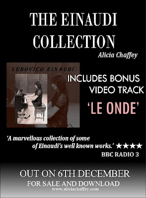
CD album cover and magazine advert (final design)
After feedback from my teachers and friends, we felt that my CD album and magazine advert designs did not follow through to the music video itself and I realised that although the project is made up of 3 different visual elements, the project needs to look like a whole package when completely finished.
I decided to use a photo of me playing the piano for my CD album cover as artists normally use their album cover to represent themselves to their audience. I feel there is now a sense of flow between the video and ancillary texts as the theme of the piano is present throughout. I also wore the same dress for the photo as in the video.
Click on the CD pages to make them larger.
PAGE 1
 Using Serif PhotoPlus 11
1. Chose a photo from several taken.
2. Cropped photo to a smaller image
3. Used the clone and colour pickup tool to erase any unwanted background objects such as a painting and radiator, to make the photo look more simple and effective.
4. Adjusted the brightness and contrast levels.
5. Selected the sepia tool to apply to photo.
6. Copy and pasted edited photo into Serif PagePlus 11.
Using Serif PagePlus 11 -
7. Selected a section of my final photo, enlarged it and adjusted the opacity to make it appear more transparent.
8. Adjusted the colour to match the other photo by using the colour selection tool.
9. Put a black line border around the photo and positioned it on the page.
Adding text in Serif PagePlus 11 -
9. Name of composer as largest font (as a CD found in the film section of any CD store, the audience will look for the composer's name rather than the artists name).
10. Added album name 'The Einaudi Collection'.
11. Added artist name 'Alicia Chaffey' in white against the black background to stand out.
 ALL PAGES
12. Applied the background image to all pages of the CD package using the Master page toolbar.
PAGE 2
13. Selected the text box tool to write my biography in.
14. Added title 'biography' in the same font as the title of the album (page 1) to add continuity.
15. Made the text white and the box black, still opting to adjust the opacity levels so that the whole of the image behind is still seen.
 PAGE 3
As the project is to submitted electronically I had to comprimise and show what my CD would look like if made in production.
16. Copy and pasted a CD template from Google.
17. Chose the crimson colour for CD as used on pages 1 and 2.
18. Added text.
 PAGE 4
19. Placed a black box over the image and used the 'send to back' button to make the image appear darker, giving the sides of the CD variety. I also think the darker side at the back of the CD looks professional.
20. Added track listing in white text.
Magazine advert
Using Serif PagePlus 11
1. Used the quick rectangle to create background.
2. Used the gradient option in the fill tool.
3. Copy and pasted CD cover into PagePlus.
4. Input text via the artistic text tool.
5. Changed the colour, size and font type using the format menu.
6. Added the stars for the rating by copy and pasting a star shape from Word 2003.
7. Selected all by holding down the Ctrl key + A and grouped objects as one.
I decided to use a photo of me playing the piano for my CD album cover as artists normally use their album cover to represent themselves to their audience. I feel there is now a sense of flow between the video and ancillary texts as the theme of the piano is present throughout. I also wore the same dress for the photo as in the video.
Click on the CD pages to make them larger.
PAGE 1
 Using Serif PhotoPlus 11
 1. Chose a photo from several taken.
2. Cropped photo to a smaller image
3. Used the clone and colour pickup tool to erase any unwanted background objects such as a painting and radiator, to make the photo look more simple and effective.
4. Adjusted the brightness and contrast levels.
5. Selected the sepia tool to apply to photo.
6. Copy and pasted edited photo into Serif PagePlus 11.
Using Serif PagePlus 11 -
7. Selected a section of my final photo, enlarged it and adjusted the opacity to make it appear more transparent.
8. Adjusted the colour to match the other photo by using the colour selection tool.
9. Put a black line border around the photo and positioned it on the page.
Adding text in Serif PagePlus 11 -
9. Name of composer as largest font (as a CD found in the film section of any CD store, the audience will look for the composer's name rather than the artists name).
10. Added album name 'The Einaudi Collection'.
11. Added artist name 'Alicia Chaffey' in white against the black background to stand out.
 ALL PAGES
12. Applied the background image to all pages of the CD package using the Master page toolbar.
PAGE 2
13. Selected the text box tool to write my biography in.
14. Added title 'biography' in the same font as the title of the album (page 1) to add continuity.
15. Made the text white and the box black, still opting to adjust the opacity levels so that the whole of the image behind is still seen.
 PAGE 3
As the project is to submitted electronically I had to comprimise and show what my CD would look like if made in production.
16. Copy and pasted a CD template from Google.
17. Chose the crimson colour for CD as used on pages 1 and 2.
18. Added text.
 PAGE 4
19. Placed a black box over the image and used the 'send to back' button to make the image appear darker, giving the sides of the CD variety. I also think the darker side at the back of the CD looks professional.
20. Added track listing in white text.
Magazine advert

Using Serif PagePlus 11
1. Used the quick rectangle to create background.
2. Used the gradient option in the fill tool.
3. Copy and pasted CD cover into PagePlus.
4. Input text via the artistic text tool.
5. Changed the colour, size and font type using the format menu.
6. Added the stars for the rating by copy and pasting a star shape from Word 2003.
7. Selected all by holding down the Ctrl key + A and grouped objects as one.
Friday, 13 November 2009
The editing style of David Fincher
Fincher has directed TV commercials for clients that include Nike, Coca-Cola, Budweiser, Heinekin, Pepsi, Levi's, Converse, AT & T, and Chanel. He has directed music videos for Madonna, Sting, The Rolling Stones, Michael Jackson, Aerosmith, George Michael, Iggy Pop, The Wallflowers, Billy Idol, Stevie Winwood, The Motels and, most recently, A Perfect Circle.
In my mind, Fincher reached his creative and technical peak between 1989-1990, when he was directing music videos for Paula Abdul, George Michael, Billy Idol and, most impressively, Madonna. Is any image filmed in 1990 more iconic than this frame, from Fincher’s video for Madonna’s “Vogue”?
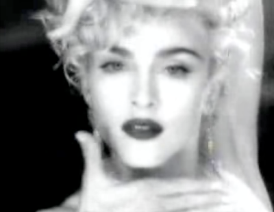
Fincher’s best video works actually function in part as tribute to the very concept of the close-up glamour shot, and he reached his absolute peak using the more-than-willing Madonna. Three of his Madonna videos ('Vogue', 'Express Yourself' and 'Oh Father', all of which made the Top 15 of Slant Magazine’s Top 100 Greatest Music Videos list) are so good that even now, 18 years on, watching them occasionally makes me go.. wow! In terms of his Madonna videos, Fincher’s close-ups are the most intimate images of the star that we have ever known.
As a music video director, Fincher had a number of signature close-ups:
- Short, seemingly inexplicable cuts to close-ups of things like teapots, leaky faucets, corporate logos, or in the case of the “Straight Up” video, to Arsenio Hall laughing. The images have no meaning on their own, but are imbued with mysterious significance by the cuts they’re sandwiched into. My favorite instance of this is in “Freedom“, when Christy Turlington apparently sets fire to George Michael’s Faith-era leather jacket–with her eyes.
- The incorporation of bloopers or outtakes. These are always close shots, so it’s possibly that they’re scripted spontaneity. See Madonna laughing while tugging on a blond curl in 'Vogue'.
- Angled close-ups of the star’s face, either lip syncing or pointedly not.
These are the key building blocks of Fincher’s music video masterpieces, and his rare missteps during this time period notably lack them. These shots are often lit and framed from above, that at times exactly replicate standard Hollywood publicity shots or film stills of the studio era.
The editing style of Guy Ritchie
Guy Ritchie was an iconic figure in the music and film industry in the 1990s and onwards. In 1995, Ritchie got a job as a runner and this proved to be the start of his film career. He quickly progressed and was directing music promos for bands and commercials by 1995. The profits that he made from directing these promos was invested into writing and making the film, The Hard Case (1995), which is a twenty minute short film that is also the prequel to his debut feature Lock, Stock and Two Smoking Barrels (1998).
Guy Ritchie is a very good filmmaker, some would call him the first of the MTV music video turned feature film directors. Although, MTV music videos tell a story with its fast cut editing style than actual cinematic shots, and Ritchie's films are nothing like that. Yes, he does use quick shot to shot editing techniques to set up a situation and/or scene, but when he gets into the nuts and bolts of a conflict in his films, Ritchie almost always keeps the shot going without any cuts.
In fact, I would consider Ritchie a landmark filmmaker. This is a man who understands the camera and it's lenses, film stocks and camera toys and he uses them with such style while he tells his plot heavy and multi-character stories with a modern musical soundtrack to carry the emotional beats of its story.
I watched the film RocknRolla directed by Guy Ritchie to really get a feel of his style. I also viewed this interview where Ritchie talks about RocknRolla and other films he has directed.
A typical Ritchie scene works like this:
- a seamless transition from the past scene to the new scene by dollying the camera and giving us something different while also keeping the same art direction style intact.
- first focus on the person and/or prop that is the focal point of the scene.
- cut to the antagonist of the scene. The person and/or thing that will get in the way and set up the overall conflict.
- cut back to the first focus as the camera moves inward, outward or side-to-side to give us the overall master shot and whereabouts of the location.
- same shot as we move towards the main conflicting situation with the character.
- same shot as we move back as the situation resolves.
- camera dollies to next scene.
Wednesday, 4 November 2009
Myleene Klass
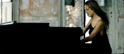
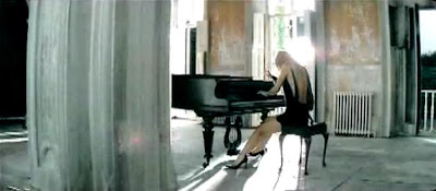
I looked at Myleene Klass's promotional video for her new album. This is a highly professional video and will particularly help me in the stages of editing.
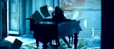
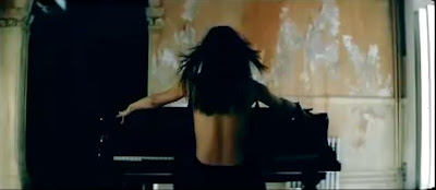 This is a really striking opening shot of Myleene as it is not a position we would expect to see as she has her back to us and is poised over the piano. The camera then introduces Myleene's face by an upwards crane shot.
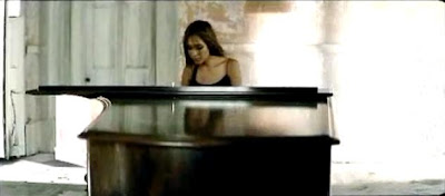
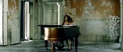
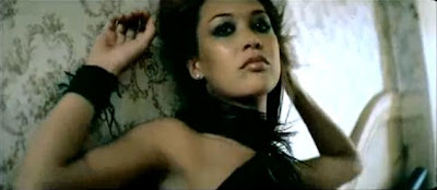 Myleene's video also includes shots of her alone, which inspired me to do the same.
 I noticed how the camera shots and angles of Mylenne playing the piano vary as not to appear repetitive, so I will need to make sure there are a variety of individual piano shots in my own video.
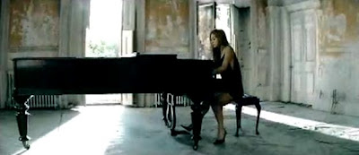
 The clever lighting has a dramatic effect as viewers. Often in this video, bright light shines through the window often obscuring our view of Myleene for a split second. I personally love this effect and will approach similar lighting in a few of my shots (long shot of piano in the main school hall, and the medium shot). I tried to copy the lighting effect by using fade to white transitions during my video.
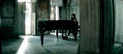
 I particularly love the setting of the old house with the white floorboards and doors and partly furbished walls. It really suits the mood of the music.
 This shot starts exactly on the first beat of the bar, i.e in time with the music. I think this is needed in some parts of a music video to emphasise the rhythms of the music. I too will use this idea in my music video.
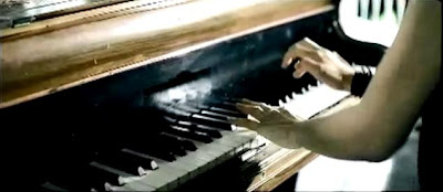
 I really liked the camera angle here and used one similar in my music video. I love the strong lighting to make the colour balance/contrast of the shot appear uneven.
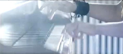
 This is a type of video effect used to create a new visual way of seeing a camera shot. In this shot, the video effect is called 'cyanotype'. I used a number of video effects available on iMovie called 'dream', 'beach bypass'.
 This is a really striking opening shot of Myleene as it is not a position we would expect to see as she has her back to us and is poised over the piano. The camera then introduces Myleene's face by an upwards crane shot.
 Myleene's video also includes shots of her alone, which inspired me to do the same.
 I noticed how the camera shots and angles of Mylenne playing the piano vary as not to appear repetitive, so I will need to make sure there are a variety of individual piano shots in my own video.


 The clever lighting has a dramatic effect as viewers. Often in this video, bright light shines through the window often obscuring our view of Myleene for a split second. I personally love this effect and will approach similar lighting in a few of my shots (long shot of piano in the main school hall, and the medium shot). I tried to copy the lighting effect by using fade to white transitions during my video.
 I particularly love the setting of the old house with the white floorboards and doors and partly furbished walls. It really suits the mood of the music.
 This shot starts exactly on the first beat of the bar, i.e in time with the music. I think this is needed in some parts of a music video to emphasise the rhythms of the music. I too will use this idea in my music video.
 I really liked the camera angle here and used one similar in my music video. I love the strong lighting to make the colour balance/contrast of the shot appear uneven.
 This is a type of video effect used to create a new visual way of seeing a camera shot. In this shot, the video effect is called 'cyanotype'. I used a number of video effects available on iMovie called 'dream', 'beach bypass'.
Monday, 19 October 2009
CD album cover and magazine advert (design 1)
I have now reached my first design for my CD cover and poster after several stages.

Stage 1 - Take photos
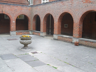
I selected this photo from the twenty I had taken of different locations.
Stage 2 - Editing photos
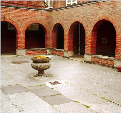
After adjusting the contrast, brightness, hue and saturation levels, cropping the image and using the lens filter and paint brush tools in Paintshop Pro I finally achieved a great looking photo.
Stage 3 - Experimenting with composition
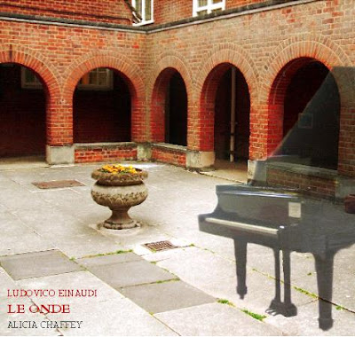
Here I added another photo I had taken of a piano and adjusted the opacity levels to make the piano slightly transparent. This was my first draft although I felt there was something else needed so I experimented with different sized frames (Paint) and played around with different fonts (Word 2007).
Stage 4 - Final product
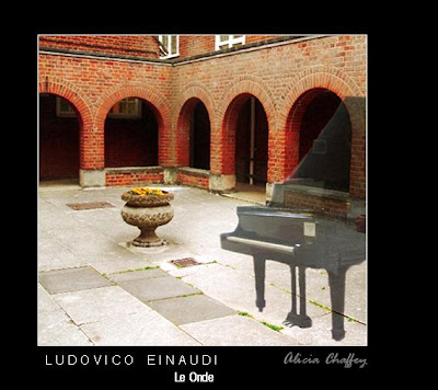
I think that the black frame and white outline to the photo enhances the cover. As for the text I thought about which line of information would the audience would recognize and so I put the composer, Ludovico Einaudi in a capitalized clear font with character spacing. The name of the album is placed below this in a slightly smaller font and my name is placed in an italic font to the right, to give the text some variety. I used a white font colour to make the text really clear against the black frame and a light grey font for my name.
Monday, 28 September 2009
Promo CD cover
As well as designing a magazine advertisement, a promo CD cover is an important element of music marketing and is required as part of the portfolio. Below are some CD covers that stood out to me and are appropriate to myself as a pianist and share a number of the common features found in the magazine advertisements.
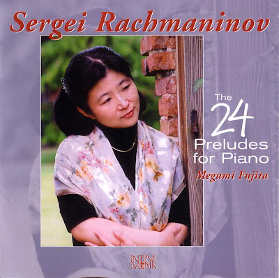
The excellent composition of picture and text caught my eye in this cover and I loved the sepia effect. I noticed that, again the darker background made the white and brown capitalized text stand out to the buyer making it a brilliant choice of font colour.
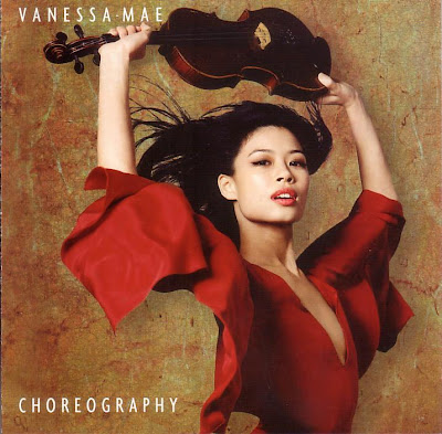
The photography is stunning in this cover. The composition is perfect as Vanessa is slightly off centre and the colours are beautifully put together. The passionate red of her dress and lipstick against her pale skin and black hair really sets the photograph off. The photograph will certainly be edited on the computer so I will use similar programmes such as Photo shop and Serif Page Plus. I love the background too as it really compliments the main colours of the photograph with combined hints of red, green and yellow. Vanessa's pose is also very striking, the photographer has thought about how to expose the violin in an original way away from the usual pose you would see when looking at a violinist.
The simple combination of red and white text in this cover works well. I also noticed that, like the magazine advertisements there is a varied choice of fonts to make it look interesting. The photograph is of excellent quality and composition and I like the way the light purple and floral top suits the slightly darker purple frame.
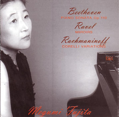
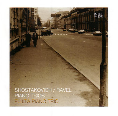
The clever use of the black and white photograph and red text has a brilliant effect here. I really like the way the photograph is extended into the sleeve note. The lighting makes an interesting contrast between Megumi's face and arms in comparison to the black piano. The combination of the italic dark red font and the bright red capitalized font really compliment each other.
I will need to experiment with different compositions, angles, lighting and placement of the camera for the best result.

The excellent composition of picture and text caught my eye in this cover and I loved the sepia effect. I noticed that, again the darker background made the white and brown capitalized text stand out to the buyer making it a brilliant choice of font colour.

The photography is stunning in this cover. The composition is perfect as Vanessa is slightly off centre and the colours are beautifully put together. The passionate red of her dress and lipstick against her pale skin and black hair really sets the photograph off. The photograph will certainly be edited on the computer so I will use similar programmes such as Photo shop and Serif Page Plus. I love the background too as it really compliments the main colours of the photograph with combined hints of red, green and yellow. Vanessa's pose is also very striking, the photographer has thought about how to expose the violin in an original way away from the usual pose you would see when looking at a violinist.

The simple combination of red and white text in this cover works well. I also noticed that, like the magazine advertisements there is a varied choice of fonts to make it look interesting. The photograph is of excellent quality and composition and I like the way the light purple and floral top suits the slightly darker purple frame.

The clever use of the black and white photograph and red text has a brilliant effect here. I really like the way the photograph is extended into the sleeve note. The lighting makes an interesting contrast between Megumi's face and arms in comparison to the black piano. The combination of the italic dark red font and the bright red capitalized font really compliment each other.
I will need to experiment with different compositions, angles, lighting and placement of the camera for the best result.
Monday, 21 September 2009
Analysing magazine adverts
As an artist in the ever changing music industry of today you have to be able to sell yourself. In order to attract potential fans and listeners the artist needs to create an individual, fresh image of themselves. Marketing and advertising is a major gateway to getting yourself recognized and informing people of your work, for example upcoming gigs and new CD releases. Adverts can be shown just about anywhere from billboards in streets and bus stops, to the Internet and television. As part of this unit of work, I will design a magazine advert to inform the public about the release of my promo music video. First, I need to analyse a selection of magazine adverts to identify what exactly needs to be produced.
Click on the images to make them larger:
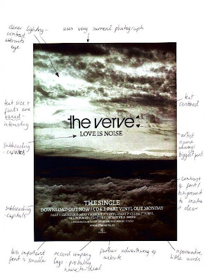
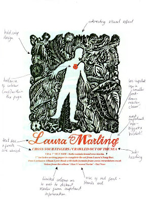
After analysing some magazine adverts I realized that there are certain elements that they all share in common:
-an individual style of design to bring across the artist in an original way.
-a bold heading in the largest font size within the page.
-fonts are capitalized and often centered to be made clearer and tended to be black against a white background or vice versa.
-a subheading that tells us the purpose of the advert, i.e. 'out now' or an album name.
-kept simple and informative with a limited amount of words.
-excellent visuals that portray the message so that the text does not have to!
-persuasive comments to attract potential buyers, i.e. 'exclusive bonus track'.
-the less important information was written in a smaller font and placed at the bottom of the page.
-varied fonts and text sizes to keep it interesting.
-a colour scheme or a limited amount of colours as so not to distract the reader from receiving the information.
-further advertising such as a web page.
Sunday, 20 September 2009
Traditional Film Camera Techniques
The following are the camera elements in any scene:
Field of View
Transitions
Camera Angle
Camera moves
Panning
Dolly shot
Crane shot
Lenses
Zoom Lenses and the Vertigo Effect
Depth of Field Effects
Basic camera shots
Extreme long shot - Characters are small in frame; all or major parts of buildings appear establishes physical context of action; shows landscape and architectural exteriors.
Long shot - All or nearly all of the standing person; large parts of a building shows a large scale action; shows whole groups of people; displays large architectural details .
Medium shot - Character shown from waist up; medium-sized architectural details small groups such as two or three people.
Close-up - Head and neck of character; objects about the size of the desktop computer fill frame focus on one character; facial expression very important
Extreme close-up The frame filled with just part of a character or very small objects facial features in a character or small objects.
Transitions
In film or video scene consists of a sequence of shots. The joining together of the individual shots to make a particular scene is accomplished through transitions.
The transition may be from one camera angle to another camera angle or from one camera to another camera. The editors task is to put together a set of individual shots into a scene. The simplest transition between shots is a straight cut, which is an abrupt transition between two shots. Another type of transition is called a fade, in which the overall value of the scene increases or decreases into a frame of just one color. For example, a fade to black may indicate the end of the sequence. When one scene fades out as another scene fades in this is a dissolve. These dissolves are used frequently to indicate a passage of time. For example, you might have a shot moving down a hall and then a dissolve as it moves into a different part of the building.
Another type of transition is when one scene wipes across the frame and replaces the previous seen. Wipes can move in any direction and open one side to the other or they can start in the center and move out or the edge of the frame and move in. Wipes are very noticeable and best not used often.
Camera Angle
The camera angle helps to determine the point of view of the camera. Viewers expect the camera to show a level horizon. High and low angled shots give variety to the camera angles and both give away different perspectives. High angled shots may force the viewer to look down upon a character and make them appear vulnerable whereas low angled shots makes a character loom above us and make them appear important and superior to us. The shots will not always show characters but building or objects for example.
Camera movement
There are several fundamental camera movements that were developed right after the invention of motion picture cameras and are still used today. Using a virtual camera you can make almost any move, however, it is still a good idea to use these real world moves. These moves include the following:
Panning and Tilting
For both of these shots the camera is stationary and rotates in a horizontal (panning) or vertical (tilting) plane.
Panning is used to follow a moving object or character, or to show more than can fit into a single frame, such as panning across a landscape. It is also used as a transition between one camera position and another. Tilting is slightly different in the sense that the camera is moved in a vertical director up or down used for example to look up at a tall building from the ground.
Dolly and Tracking shots
A dolly is a small wheeled vehicle, piloted by a dolly grip, that is used to move a camera around in a scene. A dolly shot is a move in and out of a scene, i.e. the movement is parallel to the camera lens axis. A tracking shot is a movement perpendicular to the camera lens axis.
Crane or Boom shot
This is when the camera moves up or down, as if it were on a physical crane. The same considerations for panning and tilting apply for crane shots.
Zoom Lenses and the Vertigo Effect
A Zoom lens has a variable focal length and so camera "moves" can be made without actually moving the camera. Professional cinematographers use the zoom very sparingly and generally prefer to move the camera. Amateurs love the zoom and can create some very nauseating motion by combining zooms and rapid pans. A zoom changes the angle of display so spatial relationships also change.
In the movie "Vertigo", Alfred Hitchcock took advantage of this feature to create a what is now known as the vertigo shot. This involves synchronizing the movement of the subject with the zoom so that the subject is always the same size, but the background changes. Here is an example of a vertigo shot.
Depth of Field Effects
Real cameras have a depth of field, i.e. only part of the image is in focus at anyone time. Many CG cameras have an infinite depth of field, i.e., everything is in focus, and this looks unnatural. More advanced CG systems have cameras that emulate real lenses this way.
One way to change the center of attention in a scene is to have one object, e.g., in the foreground, in focus, with the background out of focus. Then an object in the background is brought into focus, with the foreground object now out of focus.
Subscribe to:
Posts (Atom)