Click on the images to make them larger:


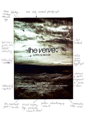
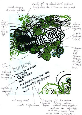
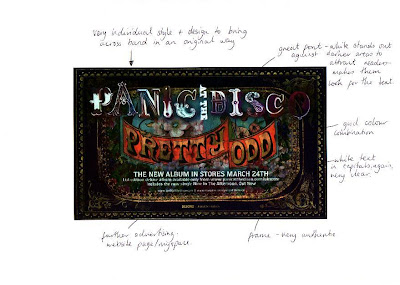
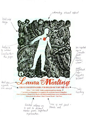
After analysing some magazine adverts I realized that there are certain elements that they all share in common:
-an individual style of design to bring across the artist in an original way.
-a bold heading in the largest font size within the page.
-fonts are capitalized and often centered to be made clearer and tended to be black against a white background or vice versa.
-a subheading that tells us the purpose of the advert, i.e. 'out now' or an album name.
-kept simple and informative with a limited amount of words.
-excellent visuals that portray the message so that the text does not have to!
-persuasive comments to attract potential buyers, i.e. 'exclusive bonus track'.
-the less important information was written in a smaller font and placed at the bottom of the page.
-varied fonts and text sizes to keep it interesting.
-a colour scheme or a limited amount of colours as so not to distract the reader from receiving the information.
-further advertising such as a web page.
No comments:
Post a Comment