Stage 1 - Take photos

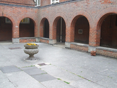
I selected this photo from the twenty I had taken of different locations.
Stage 2 - Editing photos

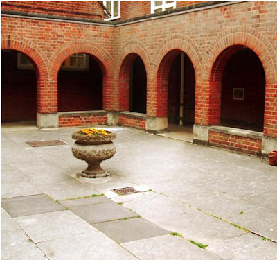
After adjusting the contrast, brightness, hue and saturation levels, cropping the image and using the lens filter and paint brush tools in Paintshop Pro I finally achieved a great looking photo.
Stage 3 - Experimenting with composition

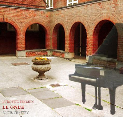
Here I added another photo I had taken of a piano and adjusted the opacity levels to make the piano slightly transparent. This was my first draft although I felt there was something else needed so I experimented with different sized frames (Paint) and played around with different fonts (Word 2007).
Stage 4 - Final product

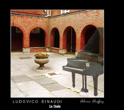
I think that the black frame and white outline to the photo enhances the cover. As for the text I thought about which line of information would the audience would recognize and so I put the composer, Ludovico Einaudi in a capitalized clear font with character spacing. The name of the album is placed below this in a slightly smaller font and my name is placed in an italic font to the right, to give the text some variety. I used a white font colour to make the text really clear against the black frame and a light grey font for my name.